There’s a lot of talk right now in Lexington about trademarks because a local brewery has a larger brewery going after them.
I figured this might be a good time to dig out an old article that’s very relevant regarding logos and trademarks:
http://www.creativepro.com/article/sometimes-a-logo-is-just-a-logo
Some key trademark takeaways from the article:
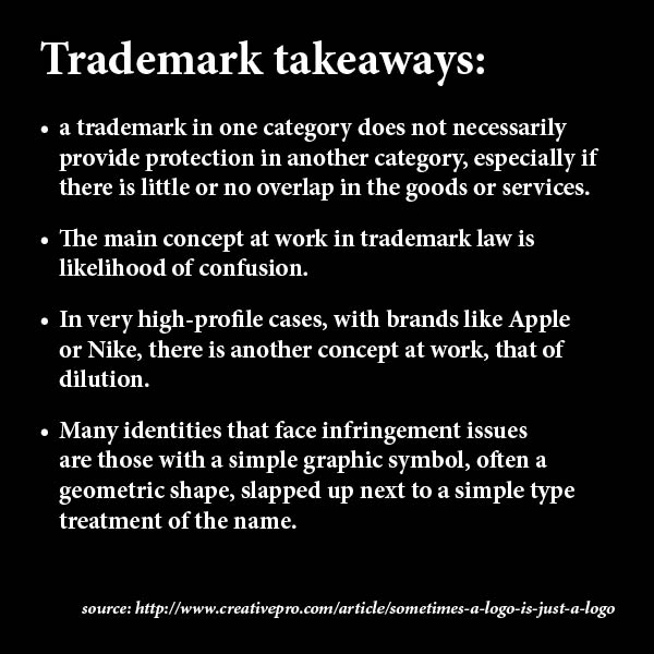
- a trademark in one category does not necessarily provide protection in another category, especially if there is little or no overlap in the goods or services.
- The main concept at work in trademark law is likelihood of confusion.
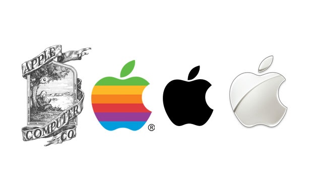
- In very high-profile cases, with brands like Apple or Nike, there is another concept at work, that of dilution.
- Many identities that face infringement issues are those with a simple graphic symbol, often a geometric shape, slapped up next to a simple type treatment of the name.
If you were a graphic designer back in 2005 you probably remember the interesting conversations being had because of a high profile company, Quark, doing a logo redesign that ended up looking like many other logos already in existence. Being used in other industries of course but it still created a lot of valuable discussion on the topic of logos and trademarks.
Related to the local debate (external links):
- Independent Brewers United says they own sixes and nines: http://boingboing.net/2013/05/22/independent-brewers-united-say.html
- Magic Hat lawsuit: Social media explodes after legal challenge that 6 is 9: http://www.aceweekly.com/2013/05/magic-hat-lawsuit-social-media-explodes-after-legal-challenge-that-6-is-9/
 There are dozens of software suites on the market that advertise “make your own logos” but there are a couple of reasons you might want to rethink that, especially if you are looking to start a business that looks professional and is in it for the long haul.