Skip to content

FascinationDesign

graphic design, print, websites, logos, ads, publications, wordpress

MENUMENU
  • Home
  • Our Projects
  • Print & Web
        • Print Design
          • Logos
          • Business Cards
          • Brochures
          • Publications
          • Advertisements
          • Photo editing
        • Web Design
          • site types
            • Business Card-style
            • Brochure-style
            • Microsite / Promo site
            • e-commerce
            • Mobile Web
            • Blogs & Podcasts
          • Online Marketing
            • SEO / SEM / PPC
            • E-mail marketing
            • Social Media
          • Domain Names
          • Hosting & E-mail
          • Stats & Analytics
  • Process & Pricing
    • Process
    • Pricing
    • Consulting
    • Subscriptions
      • Hosting & Domain Names
      • Premium E-mail
  • About & FAQ
    • F.A.Q.
    • Mission & Goals
    • About
    • Who we are
  • Blog
  • Contact

Tag: logo

Posted on June 3, 2015January 17, 2017

Why update/upgrade instead of doing a logo brand overhaul?

There is a time and a place to make a drastic change to a company’s logo and brand but it can take a lot of work, advertising and money if you already have brand recognition. With a logo update or upgrade you retain some elements or essence of what people are familiar with while getting to present and a more current look to match your company where it stands today. An update or upgrade should allow people to say “wait a second … oh there you are, looks a little different” instead of “I guess they went out of business” if you aren’t putting effort and money into a relaunch of your brand.

There are a few exceptions where a rebrand and entirely different new logo wouldn’t be difficult as well. For example if you are a one person shop with no products on a shelf then it may not be a problem because you may know all of your clients by YOU. Your face, your name, and a rebrand would not be much harder than an update/upgrade because people aren’t looking for a product on a shelf at the grocery store or looking for your sign in the window. In those cases, I say go for it if you feel it’s time for a brand new you.

Otherwise consider how much time, effort and money you want to put into helping people get to know the new you before deciding between a completely new look and just giving what you’ve already got a facelift.

Posted on March 23, 2015February 2, 2016

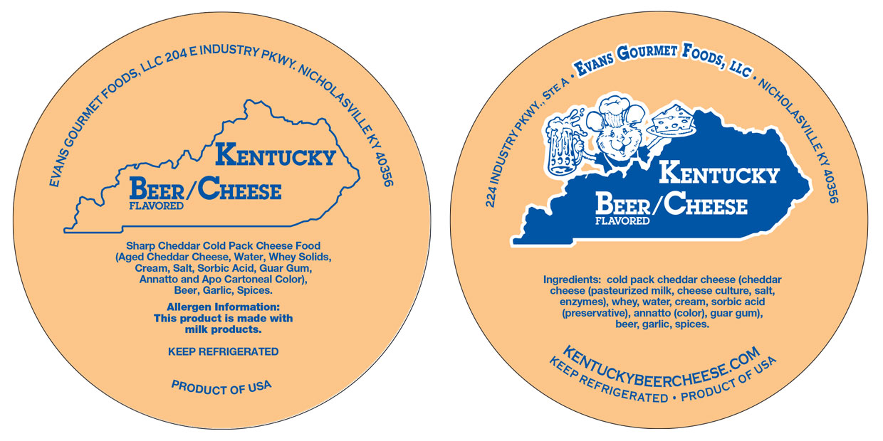
Kentucky Beer Cheese logo / branding before & after

The goal with this project was NOT to completely start from scratch. We wanted to retain some of the initial elements used in the label to retain some of the existing brand recognition while at the same time giving them a cleaner more polished look that popped more when you were scanning through a case of products.

Another element was that they wanted to incorporate a mouse mascot that had been used on some t-shirts they had had made.

Lid: KY Beer Cheese logo before and after

Left, before. Right, after. 

They also weren’t going to have a large marketing push after the change so it still needed to be recognizable enough to pick out in a case of beer cheeses.

It’s a cleaner more professional look that stands out more in the case now without alienating their existing customers.

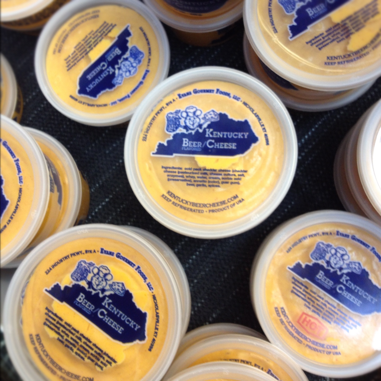
Kentucky Beer Cheese in grocery case

Website header Before:

After:

Not exactly my favorite header here but I wasn’t hired to work on the website, just the logo and I wanted to make sure they had an easy to upload image that replaces the existing one.


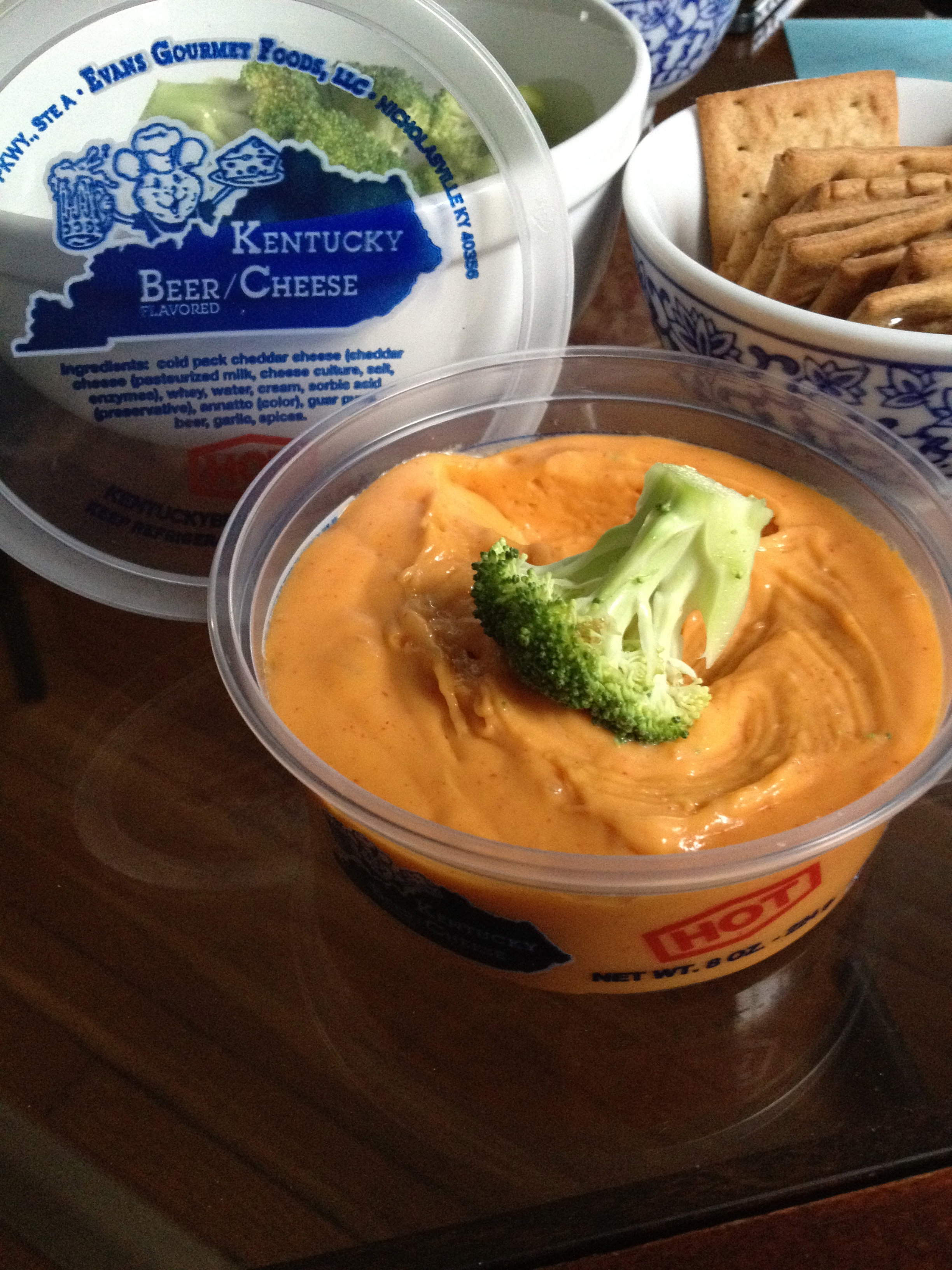
KY Beer Cheese as a dip

Posted on May 8, 2014February 2, 2016

#TBT circa 2006: Central Kentucky Computer Society (CKCS) logo design

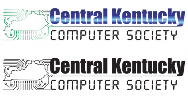
Maybe a little gradient heavy on the color version of this logo for Central Kentucky Computer Society but it was designed quickly and makes it obvious at a glance that this group is about computers. Not too many frills, all computer, all Kentucky. With one fun little twist on the state outline that looks like a circuit board.

#logodesign #branding #logos #Kentucky

CKCS-logo-2006

Posted on May 1, 2014February 2, 2016

#TBT circa 2003:
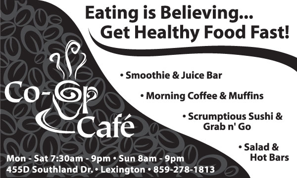
Co-op Cafe logo design, ads, & supporting materials

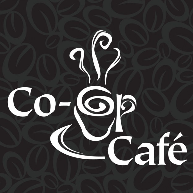
co-op cafe logo with coffee beans circa 2003

#TBT (throw back Thursday) circa 2003: Co-op Cafe logo designed by Fascination Design and design of other supporting materials.

The logo was designed back before Good Foods knew how the new space was going to work and also at a time that they thought the cafe was going to be open different hours from the store. They stopped using the logo when they decided that they wanted to be a “market” instead of “the co-op” and rolled everything into one a year or two later.

Co-op Cafe logo and ad design Lexington KY


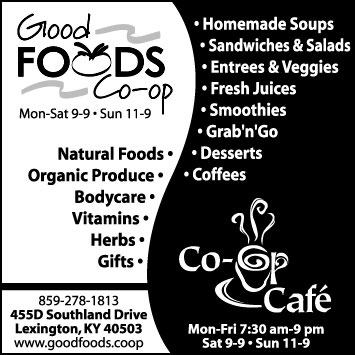
I also designed a slew of ads back in 2003 for Good Foods & the Cafe that worked around this split identity of the market and cafe while showcasing what each had to offer.

All of the ads had a organic fluid or yin/yang element and were meant to be really striking on newsprint. The designs also often had to accommodate a lot of text without looking cluttered.

Good Foods Co-op ad 2003 Lexington KY


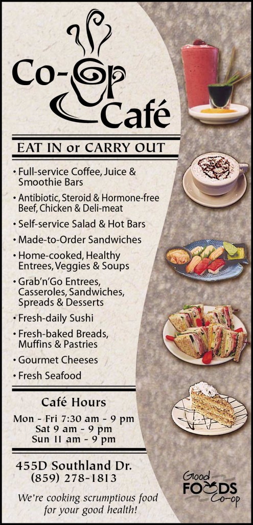
I remember the full color menu being a particularly fun piece to work on. All of the photography was of food actually made in the store and involved a very low key photo shoot. 

Co-op Cafe Menu 2003

There are many many more ads and supporting materials that weren’t shown here.


Posted on January 10, 2012January 17, 2017

Anatomy of a homepage {infographic}

++ Click Image to Enlarge ++
The Anatomy of an Effective Homepage
Source: The Anatomy of an Effective Homepage Infographic

Tags

  • #tbt
  • .php
  • ad
  • Ad Design
  • advertising
  • analytics
  • branding
  • content
  • design
  • drupal
  • e-newsletter
  • ecommerce
  • facebook
  • g+
  • games
  • google+
  • hosting
  • infographic
  • inspiration
  • iphone
  • logo
  • logo design
  • marketing
  • navigation
  • passwords
  • podcast
  • ppc
  • printing
  • Productivity
  • promotions
  • reference
  • security
  • seo
  • snippet
  • Social Media
  • social networking
  • spam
  • top ten FAQ
  • troubleshooting
  • twitter
  • USP
  • video
  • website
  • wordpress
  • worth sharing

Products we ♥

  • AwayFind Stop checking email every 5 minutes! AwayFind will notify you of important or urgent messages on your mobile device with an SMS, Voice call or even via iPhone & Android apps.
  • Dropbox Sync files between computers and other devices.
  • EchoSign Digital Signatures for project sheets, contracts or any other document you might need to have signed quickly.
  • Evernote Save your ideas, things you like, things you hear, and things you see.
  • Freshbooks Easy invoiceing and time tracking.
  • Lastpass Store all of your passwords securely.
  • MailChimp Create, send, and track email newsletters.
  • Moo.com Printing Small quantity print runs where many items can have more than one design. Great for photographers or anyone wanting to showcase their work.
  • Paypal Take credit cards online with no monthly fees. Great for small businesses.
  • Rapportive CRM plugin that replaces Gmail ads with useful information about your contacts. Also works with Google Apps.
  • SlideDeck An excellent premium WordPress content slider & gallery plugin. Quick to implement & lots of sources to choose from.
  • Square Take credit cards on the go from your iphone or ipad. Great for trade shows or other instant in person payments.

Glossaries & References

  • Interactive Advertising Bureau (IAB) Advertising Glossary
  • Printing Industry Glossary
  • Smashing Magazine Web Design Industry Jargon
  • Typographer’s Glossary from FontShop.com
  • Vimeo Video School
  • W3Schools Web Glossary
  • Wee Nudge design info for non-designers
  • Standard Terms & Legal Stuff
  • Hosting TOS
  • Copyrights
  • Privacy
  • Employment or Partner with Us
  • Facebook
  • Instagram
  • Twitter
  • Pinterest
  • Youtube
  • LinkedIn
  • Dribbble
  • Behance
Site managed by: FascinationDesign.com