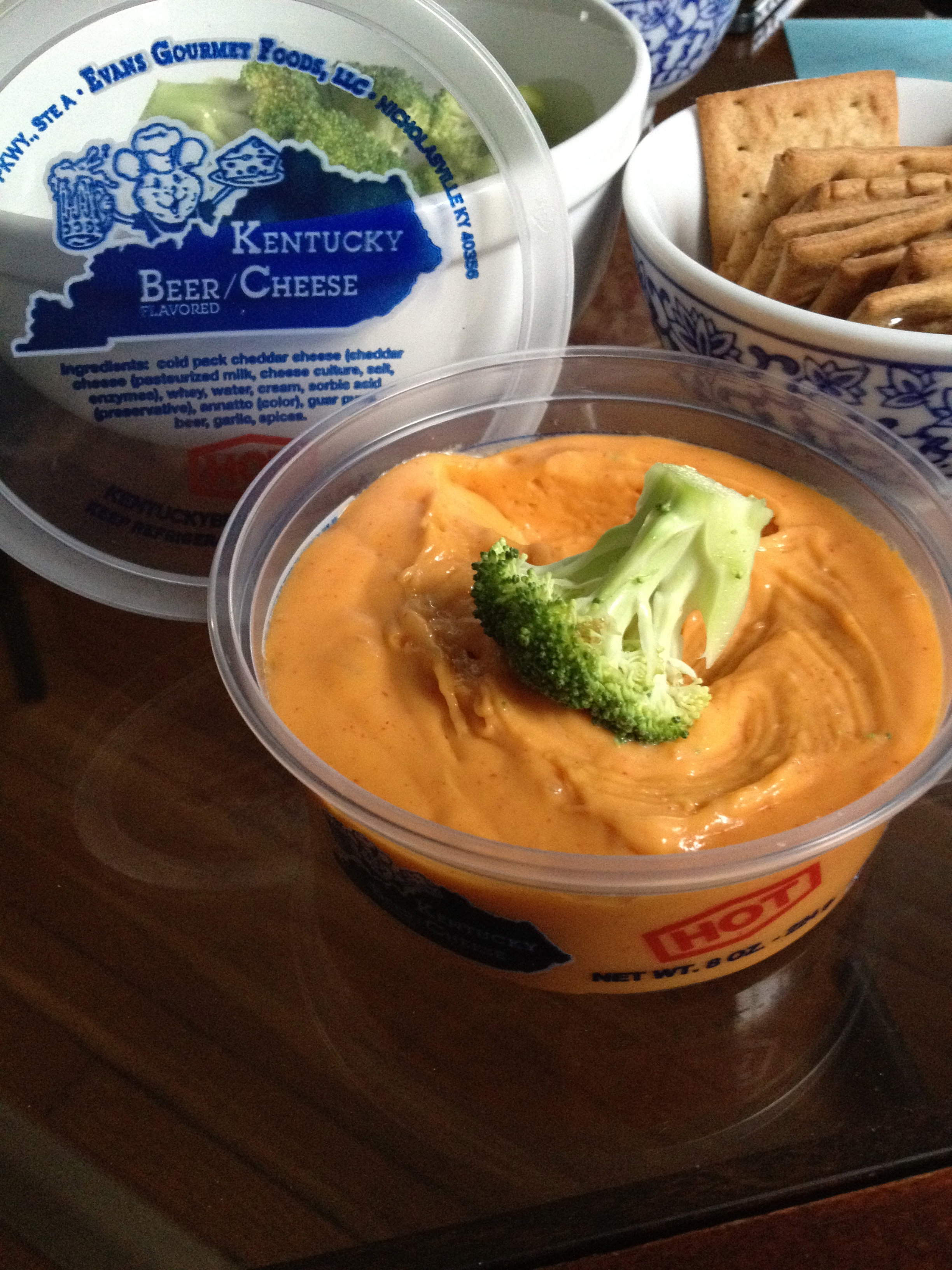
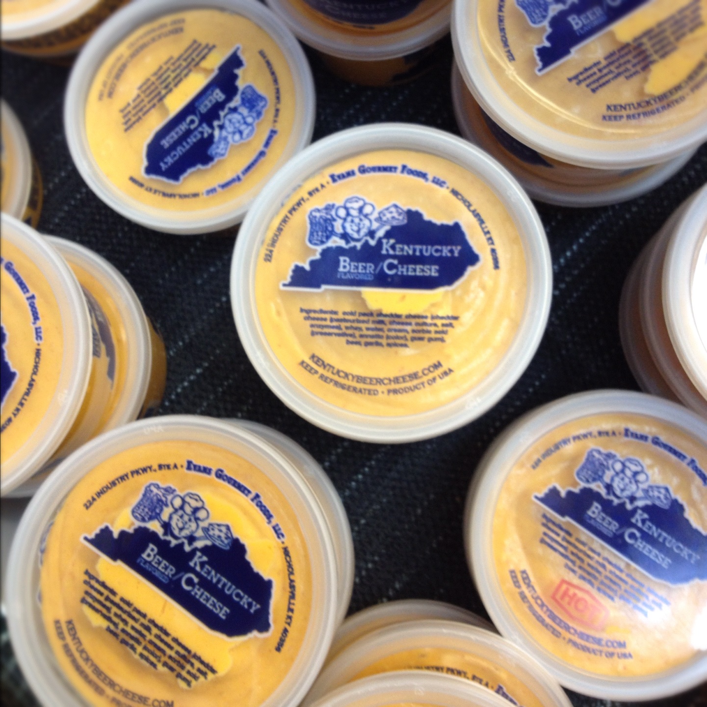
The goal with this project was NOT to completely start from scratch. We wanted to retain some of the initial elements used in the label to retain some of the existing brand recognition while at the same time giving them a cleaner more polished look that popped more when you were scanning through a case of products.
Another element was that they wanted to incorporate a mouse mascot that had been used on some t-shirts they had had made.
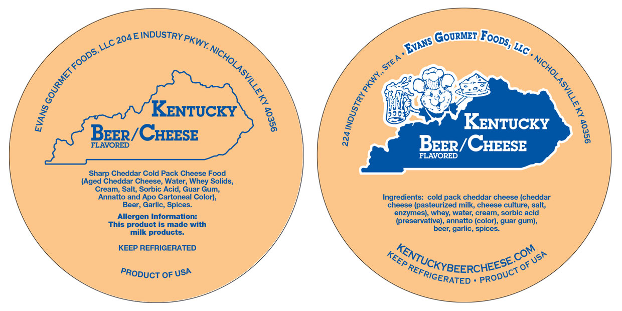
Left, before. Right, after.
They also weren’t going to have a large marketing push after the change so it still needed to be recognizable enough to pick out in a case of beer cheeses.
It’s a cleaner more professional look that stands out more in the case now without alienating their existing customers.
Website header Before:
")
After:

Not exactly my favorite header here but I wasn’t hired to work on the website, just the logo and I wanted to make sure they had an easy to upload image that replaces the existing one.