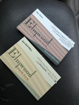
New Elmwood Stock Farm business card on top, old business card on bottom in the photo. (Click photo for a closer look.)
Visual update that’s a crisper, cleaner, stronger look from an old design. The colors are similar but we can make other marketing look a little more modern. Also not a drastic enough change such that existing materials won’t look out of place.
Text is also easier to read. (Cell phone numbers and address blurred for the web because they don’t use them on most other materials.)
Design was a recreation with only the logo available as a digital file.
The new colors I think look a little more like a farm as well.
