![]()
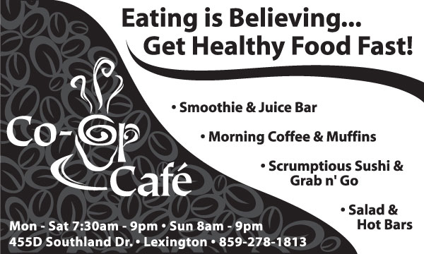
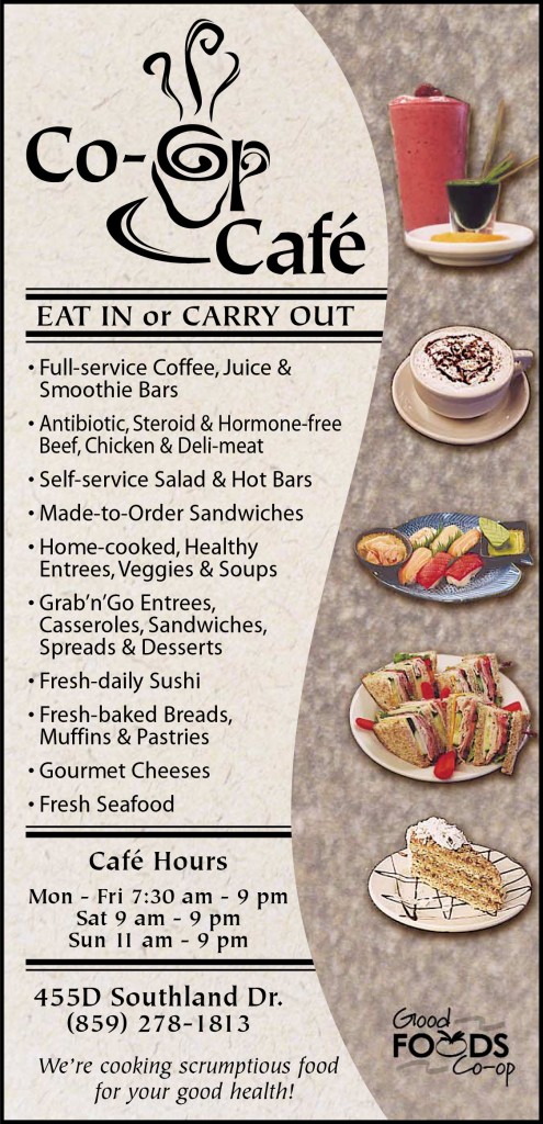
#TBT (throw back Thursday) circa 2003: Co-op Cafe logo designed by Fascination Design and design of other supporting materials.
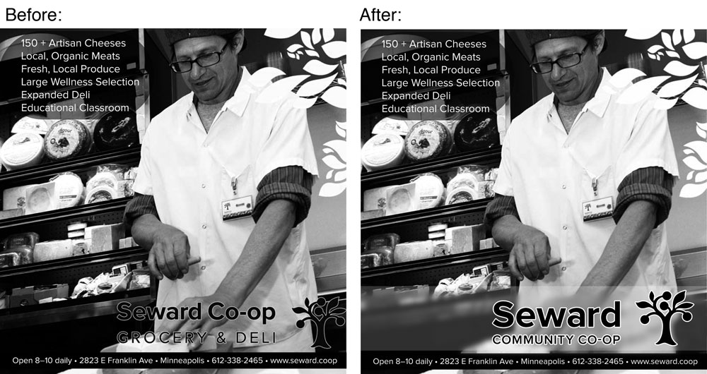
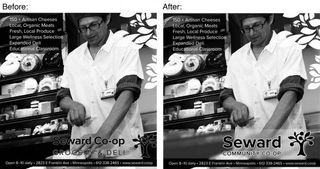
The logo was designed back before Good Foods knew how the new space was going to work and also at a time that they thought the cafe was going to be open different hours from the store. They stopped using the logo when they decided that they wanted to be a “market” instead of “the co-op” and rolled everything into one a year or two later.
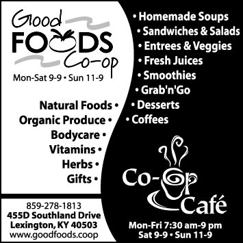
I also designed a slew of ads back in 2003 for Good Foods & the Cafe that worked around this split identity of the market and cafe while showcasing what each had to offer.
All of the ads had a organic fluid or yin/yang element and were meant to be really striking on newsprint. The designs also often had to accommodate a lot of text without looking cluttered.
I remember the full color menu being a particularly fun piece to work on. All of the photography was of food actually made in the store and involved a very low key photo shoot.
There are many many more ads and supporting materials that weren’t shown here.