 Client: Claire & Tom via HotFut
This was an unusual situation where Chris Jeffries of HotFut contracted with Fascination Design on this project when he realized he was in over his head without much time left to get the website live.
This site was built and launched within 48 hours of having the project details. We had a draft ready in 24 hours and the minor changes and testing was completed in just under 2 days.
I can’t guarantee this short a time frame with every project type but it isn’t impossible for select sites. It helped that the clients were extremely organized and responsive.
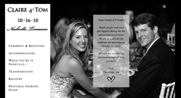
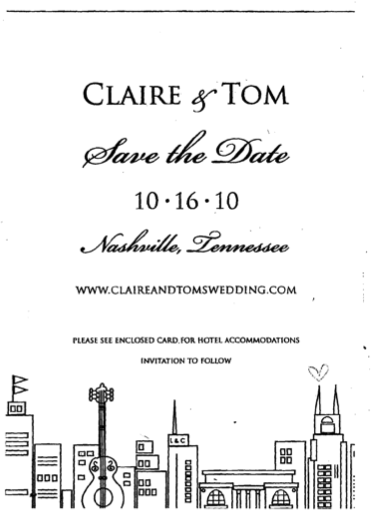 The primary goal of the site was to be simple, elegant, non-cheesy, informative (6 pages and a PDF) and done asap. The site was to be developed using html, css and php.
Look and feel of the site: The site was to be simple, elegant and compliment the “Save the Date” card (but did not need to match exactly.)
Rough list of requests:
- Simple mouseover highlights on the navigation items would be good – very simple, probably just invert the selection.
- Format the secondary pages using a photo or two for each page.
- Create an elegant PDF that wedding guests can print and carry with them for the weekend.
- Google maps for the ceremony and reception.
What the clients said:
I n my opinion, elegant is one of the hardest things to accomplish in a website – there’s a fine line between elegant and infantile. Not to mention it’s so easy to cheese up a webpage with too many frills and too much information. I think we walked those lines very well.
In my mind, two things made this possible:
- Claire’s vision and communication – she knew what she wanted and gave great feedback that helped us get the rough design right
- Hilary’s skills – Hilary did a great job of taking in everything and turned our rough design into reality, in very short order.
I’m thrilled with the finished product and I’m glad you are, as well!
– Chris Jeffries, Owner HotFut
I love the site and think it is just perfect. I like the added details that tie with the save the date invite such as the heart on the letter and our names at the upper left. Thank you for your help and design!
– Claire
Interact with the archived website:
http://fascinationdesigndemo.com/claireandtomswedding/


 n my opinion, elegant is one of the hardest things to accomplish in a website – there’s a fine line between elegant and infantile. Not to mention it’s so easy to cheese up a webpage with too many frills and too much information. I think we walked those lines very well.
 love the site and think it is just perfect. I like the added details that tie with the save the date invite such as the heart on the letter and our names at the upper left. Thank you for your help and design!