Fiverr – you might want to rethink that $5 logo purchase

That $5 logo from Fiverr might just be a stolen design … or at least not as unique as you thought.

https://medium.com/@sachagreif/in-the-past-couple-years-startups-have-started-realizing-that-good-design-can-make-the-difference-2fdeb90d390a

Need a reason your logo should be professionally designed? Or at least a reason you should be cautious when using a cheap / crowdsource site? There are people calling themselves designers who are simply stealing designs from other places, throwing in some text and selling them.

This was one of the designers they advertised in Fiverr’s e-newsletter:

fiverr copyright violations

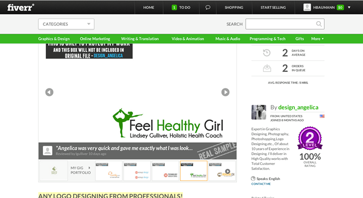
The silhouette in the logo was familiar enough to me that I instantly recognized it as the Yoga Australia logo and that it was stolen because of the unique design that included the outline of Australia in the yoga pose.

yoga australia logo

When I submitted a comment to Fiverr about the copyright violation I got not response.  And two months later this design is still up and this profile hasn’t been removed. Clearly they don’t take copyright violations seriously.

Copyright violations in designs you paid for:

Ignorance is not bliss:
the buyer of the design will be liable for violation of copyrights.

Just because you paid someone to design your logo, if you use a stolen design you are the one the copyright holder will be able to come after. Not knowing your design was stolen does not change the ownership of the design.

Even if you are only hit with a cease and desist letter it will probably cost you more than your original $5. Think about the number of things that would have to be redone. Store signage? Business cards? Website? Menus? Promotional materials?

Think of all the things you would have to change the logo on. How much could that cost you?

You get what you pay for… Is it really worth the risk?

PS – I searched for the person who bought the design of Fiverr and luckily she’s not actually using the design.

PPS – since I suspect that Fiverr will let this “designer” continue to rip people off until they get so much flack they can’t ignore it, I’m posting the link to the designer’s listing:  http://www.fiverr.com/design_angelica/design-a-beautiful-logo-only?funnel=201408301836282506837040
Granted getting her removed might not keep her from coming back as a new profile AND it doesn’t stop others who are also violating copyrights by using other people’s works in or as their own designs.

Thought of the day: policies and procedures

Thought of the day: You put policies and procedures into place not just for an organization/business but also for the purpose of clear communication with those outside of an organization.

Ex: If an advertiser doesn’t have a deadline, they can’t meet the deadline. If their ad or check comes in late/after going to print because you didn’t tell them when it should be to you by, they’ll likely get upset because they weren’t given the chance to do something differently and make it in on time.

Sometimes a lack of policies and procedures ensures you’re setting yourself and/or someone else up for failure. Policies & procedures help set a standard to ensure key pieces of information are clearly and accurately communicated to more people and with regularity.

The Adobe Illustrator Storey {video inspiration}

The Adobe Illustrator Story from Terry Hemphill on Vimeo.

When Adobe Illustrator first shipped in 1987, it was the first software application for a young company that had, until then, focused solely on Adobe PostScript. The new product not only altered Adobe’s course, it changed drawing and graphic design forever.

Watch the Illustrator story unfold, from its beginning as Adobe’s first software product, to its role in the digital publishing revolution, to becoming an essential tool for designers worldwide. Interviews include cofounder John Warnock, his wife Marva, artists and designers Ron Chan, Bert Monroy, Dylan Roscover and Jessica Hische.

Why does the color on my screen not look like what was printed?

http://www.paperspecs.com/why-print-colors-hard-to-get-right/

The link above is the long explanation on why I double check by the numbers, not just by sight, any colors or corrections made to photos for print designs. We try and come as close as possible to the color you are working for when it comes to full color printing.

No matter how much you calibrate your monitor to match, ink is still different from the colors produced on a screen. The numbers don’t lie AND your monitor also can’t take into consideration the paper you are printing on.

If you are using a pantone spot color, of course your color will be exact as spot colors are matched exactly to pantone specifications.

A Pantone swatchbook is also a useful tool for reference even on full color projects. So are color match proofs. If you are picky about your colors, a color proof should be done prior to printing for a full color project. Often created by a sublimation printer or inkjet printer, these color proofs are used to make any final adjustments or calibration to the press before doing the full rung.

Color proofs are sometimes not an option with cheaper print runs. Some bulk printers won’t do them because they create a project delay while being approved and create an extra step in the printing process itself.

It doesn’t hurt to work with someone who is familiar with the process and the various factors that affect the colors of a printed piece to help you achieve the look you are going for either. 😉

More info on color proofs: http://en.wikipedia.org/wiki/Prepress_proofing


#colorcorrection #pantone #printdesign

When it comes to a successful user experience,
How does your product or service make people FEEL like a better person?
{ worth sharing }

How does your product or service make people FEEL like a better person?

When it comes to a successful user experience …

“…one fundamental question must be asked – what problem are you solving for the customer?

Ultimately that is what user experience design is about – it’s about solving problems for users. It should empower users, making them feel they can do something that they were previously unable to do.” — http://boagworld.com/digital-strategy/user-experience-design/


Screen Shot 2014-06-03 at 6.01.04 PM

#TBT Cooper Management website circa 2003

#TBT (Throw Back Thursday) Cooper Management website circa 2003

(Keep the year in mind when you’re watching this video. It is a website for a company that has since been absorbed into one of the national financial service franchises.)

Video seemed more appropriate for this post so you can see the hover effects and several pages as well as some other key features of the site.

Many of sites I designed before 2006 or so are what I called scalable or fluid sites so that no matter the screen size, no matter the window size, the design and content fit. This would now technically be called responsive design today.

HOWEVER I would NOT design a site using a table based layout at this day in age which is how I achieved this back in 2003. (Designers / developers know what I’m talking about here!)

The technology was simply different at that point in time. You did not have the number of smartphones / really small screens and you also didn’t have the really large monitors that you see more of today. That said, this still works seamlessly in modern browsers from my archive files.

It’s also very basic and clean website that gave a quick business overview, included their logo and included their contact info with consistent navigation and footer information across both pages. Not bad for 2003 right? 🙂

#responsivedesign #responsivewebsite #websitedesign #websitedevelopment


Some quick screen shots as well:


#TBT circa 2000: UC logo / monogram logo cleanup and vectorization

UC-logo-vectorization800x800

This project was re-creating what already existed in a much more scalable format. The logo was hand traced as a vector file and the logo cleaned up.

When I say “hand traced,” I don’t mean with a pen or pencil though. Tracing in this instance involved working with bezier curves to create shapes in Adobe Illustrator. It is a bit of an art form to draw with something that looks like this: http://en.wikipedia.org/wiki/B%C3%A9zier_curve

There are now other ways to convert artwork into vector graphics now hand drawing or tracing in Illustrator is still a viable way to create a very clean version of a logo.

Vector graphics are completely scalable without pixelization and are an ideal format for logos that will be used in a variety of ways and sizes. Vector file formats are typically eps, ai, or svg.

More info on vector graphics for those interested: http://en.wikipedia.org/wiki/Vector_graphics